BotNot
Roles
The first and only UX/UI Designer; Collaborate with 2 founders and 2 developer leads
Responsibilities
Heuristic evaluation; UX design; UI design; User interviews; User testing
Time
May 2022- Aug 2022
~3 months


—
The Hidden Data Struggles of a Shopify Merchant
Small and medium-sized Shopify merchants are master jugglers. From designing products to managing marketing, customer support, and operations, they handle it all while keeping their business running. After talking to many small business owners, we found the two main critical data challenges they face.


1. Merchants Lost in Their Numbers
As solo entrepreneurs handling everything themselves, they lack the resources to do data analysis, yet Shopify's built-in tools aren't enough to help them make sense of their business data.

2. Bot Traffic Corrupting Business Insights
Solution
Impact
100%↑
Early User Base Within 90 Days

Company Stage
Project Goal
Create insightful and easy-to-use data dashboards to ease the pain of data analysis and filter out bot traffic for e-shop owners and employees to make informed business decisions.
Success Metrics
Growth in user base and daily active users. As we didn't launch the product officially before, user growth is our top business metric.
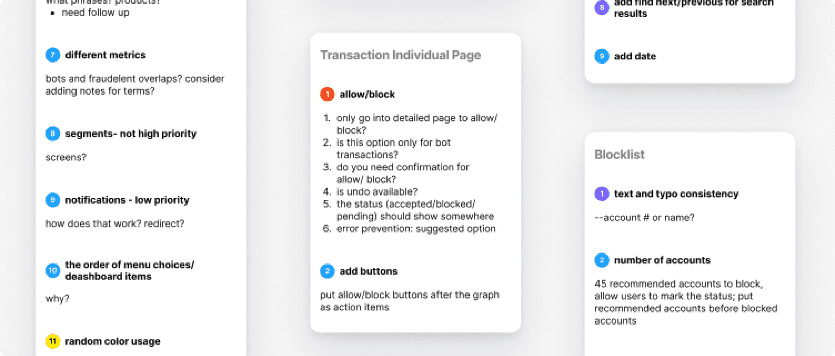
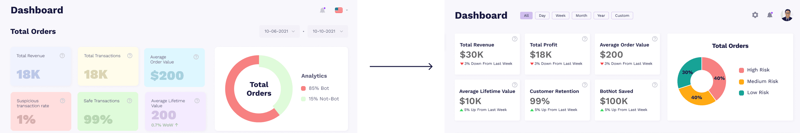
Uncover Issues in Existing Interface
I choose heuristic evaluation to identify problems in their initial interface. After conducting heuristic evaluation based on Neilson’s 10 usability heuristics and accessibility, I found lots of problems in content, information architecture, user flow, and UI.

1. Usability Problems
1) Inconsistent color usage and component design
2) Redundant and inconsistent information
3) Not accessible for colorblind people

2. Incomplete User Flows
Lack of customer overview, recommendation overview, and individual pages. Users cannot finish the actions in a full cycle.

3. Too Many Numbers Without Actionable Insights
The interfaces looked like an excel data dump, which is challenging for less data-savvy users to digest.
Collect User Needs Through Interviews

1. Users want to know meanings behind data
Interviewee
E-shop Owner
2. Building user trust is essential to a business
Interviewee
E-shop Owner
3. There is an unmet need for individual customer analysis
Interviewee
E-shop Owner
Optimize Site Structure for Quick Insights and Action
I structured the dashboard to help merchants quickly understand and act on their data:
Sidebar Hierarchy
Placed actionable recommendations at the top for immediate visibility
Consistent Two-Level Information Hierarchy
This structure lets merchants choose between quick glances and detailed dives
Overview section at the top provides quick insights
Detailed individual pages below for deeper analysis
Below are the information architecture and different layout options that I have explored.


Iterate Based on Design Principles
Scalability
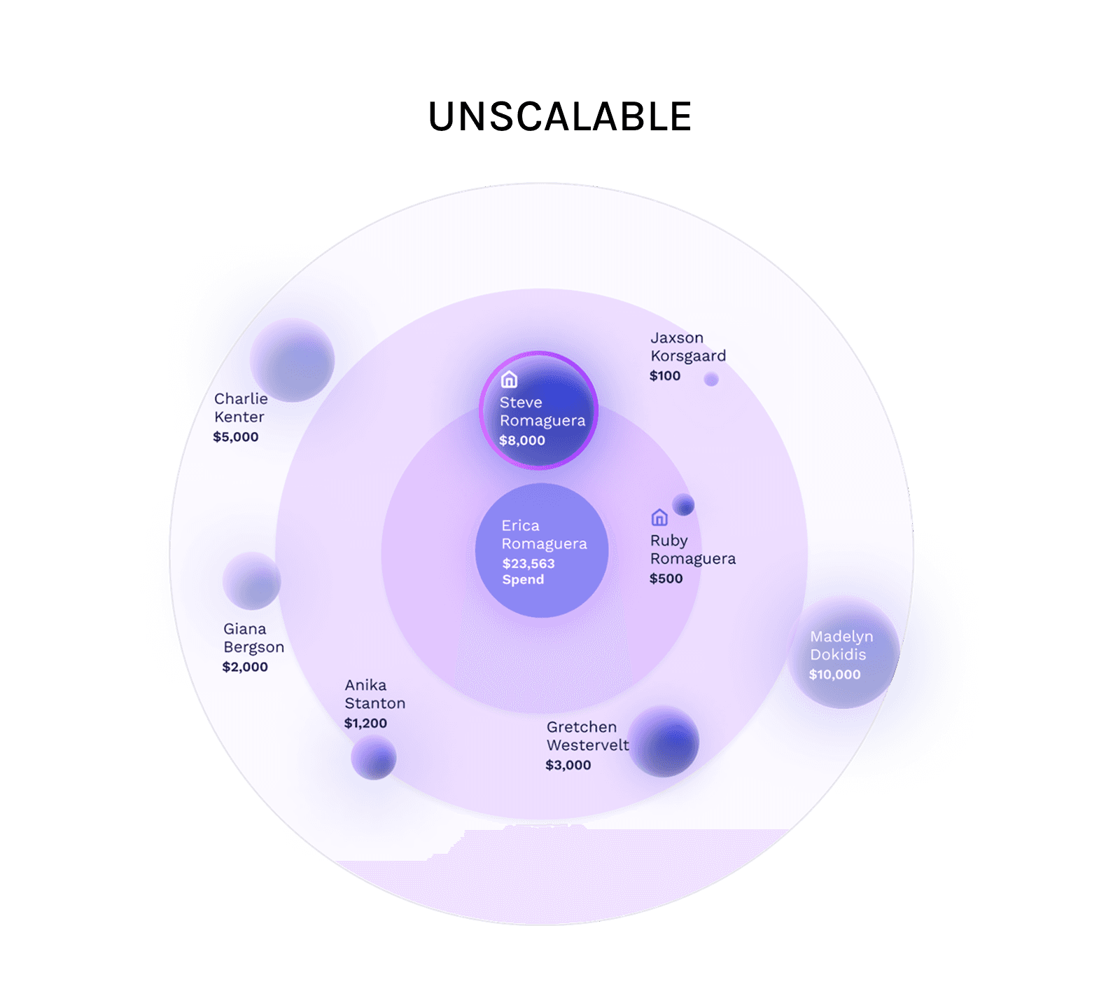
Before
My initial design used simple bubbles to show connections of an account, but this wouldn't work well as businesses grew.

After
To improve scalability, I added segment controls and filters that let users highlight only the most relevant connections, making the graph useful even with large amounts of data.
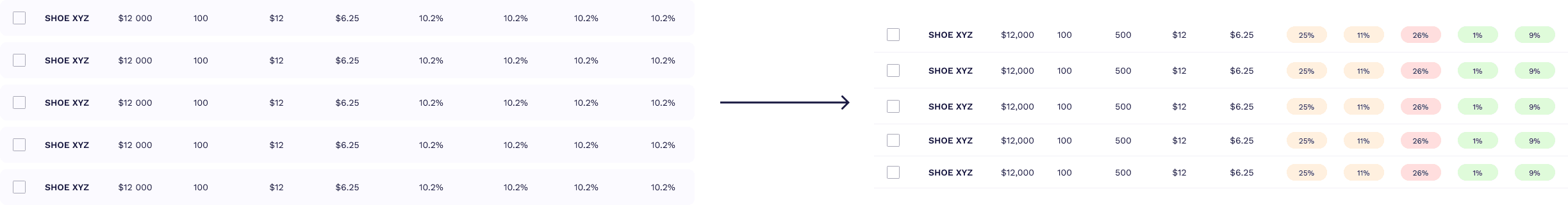
Consistency
Visual consistency builds trust. Otherwise, people might think, "How can I trust data if you can't even keep a simple filter consistent?"

Before
Initially, the components were designed independently, leading to inconsistency across the dashboard.

After
Applying principles from atomic design, I created a unified system for all components like filters to ensure a cohesive experience.
Simplicity
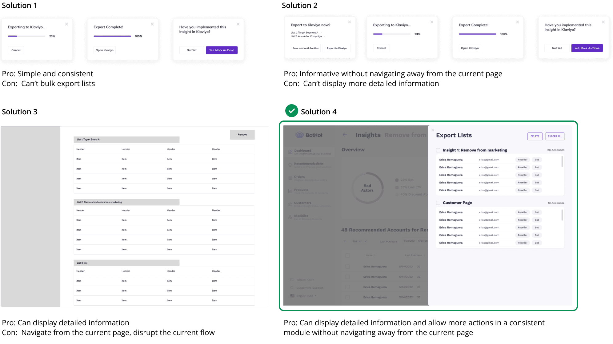
Simple design was essential - our users already deal with complex data, so the interface shouldn't add to their mental load.
When I was designing a new export flow to other SAAS software, I tried different layouts: 1) pop-ups without preview; 2) pop-ups with preview information; 3) a full page overlay; 4) sidebar overlay. Considering information density and layout consistency, I finally decided on a sidebar overlay design.
Iterate Based on User Feedback
I conducted 5 tests with current and prospective clients. I chose user testing because it can help us validate our design concepts, find new problems, and evaluate users' satisfaction at a minimal cost before launching the product. Three main insights are:
Help users process information faster
Looking at lots of data all at once is tiring for users. I need to add color coding or any other means whenever possible to help them digest data.
Use colors meaningfully but not distracting
I showed three UI options to users: the first one had colorful cards; the second one didn't have colorful cards; the third one was mono-color with gradients. All the users selected the second one. They wanted some colors to convey meanings but didn't want colors to be distracting.
Make tabs more prominent to encourage usage
Users primarily used the sidebar instead of the four main tabs on the table, complicating the user flow. One user stated they didn't notice the tabs during testing. To simplify operations, making segment controls more prominent may increase usage of this table.

Actionable Recommendations
To solve pain point: users don't know meanings behind data, users can enhance their business by acting on highlighted recommendations, now prominently featured as the default tab on the homepage, encouraging engagement through easily accessible action buttons.


Impact Visualization
Users mentioned they won’t trust the data and recommendations automatically. They will first try it out and see the impact. If it works, then they will trust it. Therefore, I designed a BotNot impact visualization to show them visually how much money BotNot save them.
Seamless Integration with External Tools
To make recommended actions implementable, I designed this export flow to Klaviyo so that users can manage their marketing email lists on other platforms.

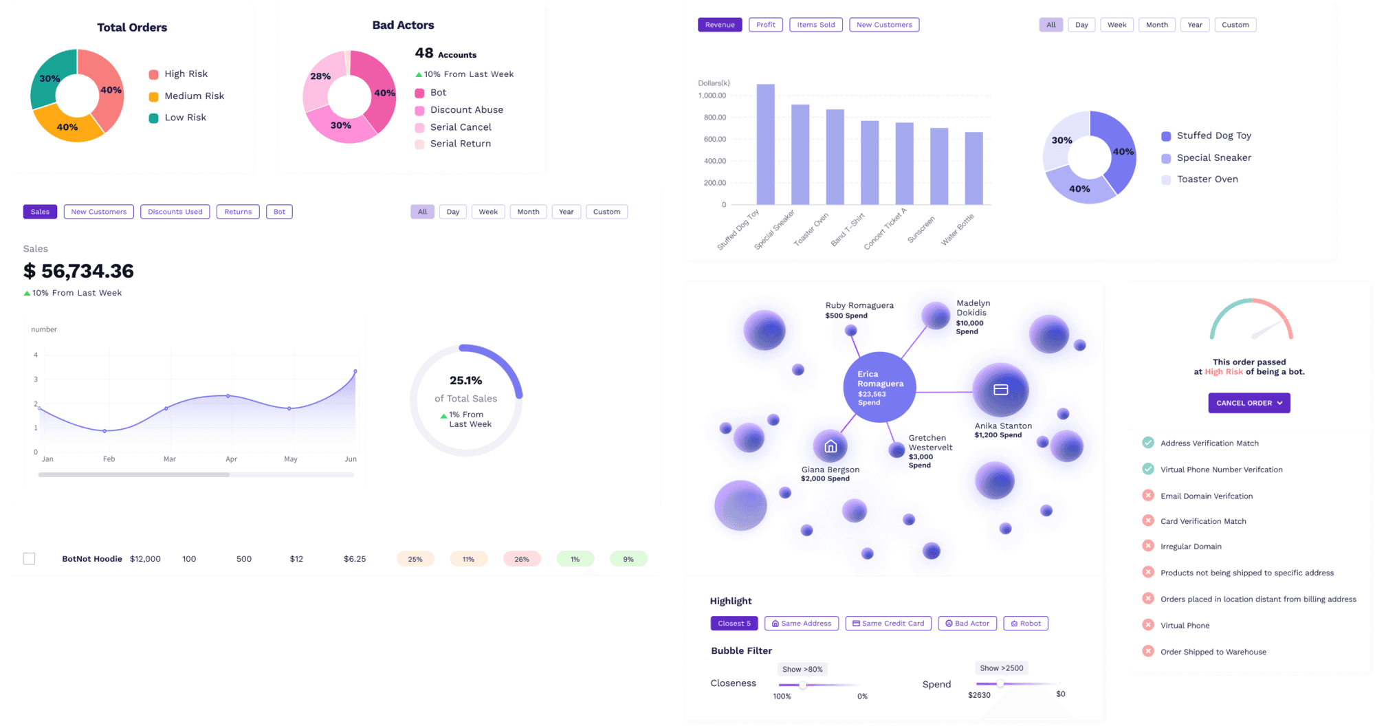
Data Visualizations
Too many numbers and excessive information is challenging for less data-savvy users to process. Therefore, I added various types of data visualizations on every page and marked raw data with visual aids, such as colors and tags, to make data more digestable.

Learnings
1. During early stages, product strategy can go back and forth pretty frequently, thus following atomic design principle and starting from the building smallest components can save you lots of time.
2. For companies who don’t naturally value user research, when I want to advocate for user research, I need to help them see the value, such as conducting trial interviews in my own network.
3. Working in a startup can be risky, but can also be rewarding and fun. I enjoy making more impact and seeing the impact in a short amount of time.
Room for Improvement
1. Currently, some information on individual pages didn’t get completely aggregated on overview pages. If I have time, I might explore more ways to aggregate information.
2. Continue improving design system by designing different states and nailing down more details with developers.